Iponweb
IPONWEB is an AI, data & engineering company. Renowned in the ad tech industry as a pioneer, this enigmatic Russian enterprise is the global leader in their field.
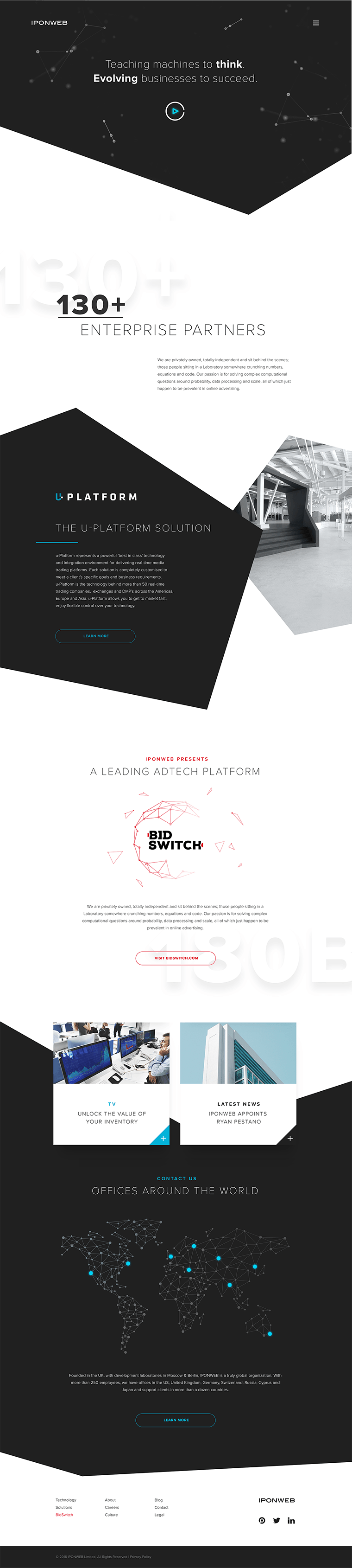
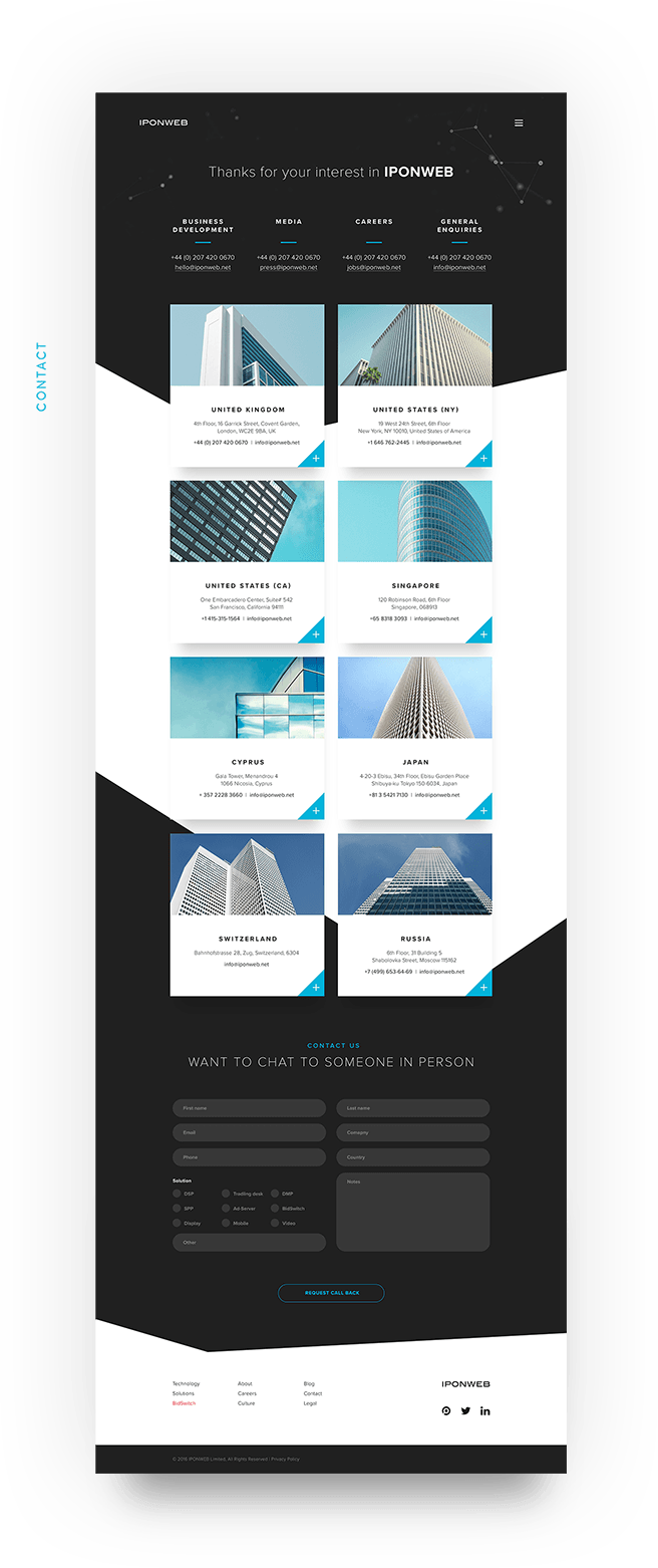
While the quality of their bespoke trading platforms is second to none, this excellence was not reflected in the company website. With a strong brand in place already, my goal was to design an exciting new web presence. Seeking a fresh aesthetic to work with beyond their existing guidelines, I was inspired by the architecture of their Moscow office. Influenced by the striking geometric shapes, I created a new graphic treatment which subtly evolved the existing brand and translated Za Bor architects vision into the digital domain.

User Experience
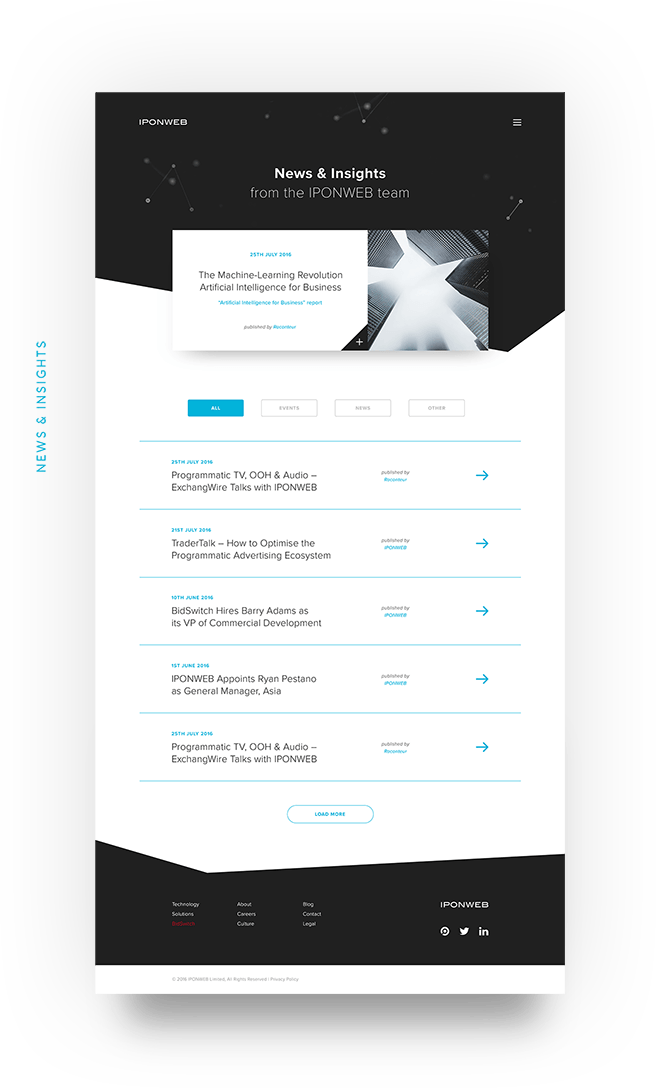
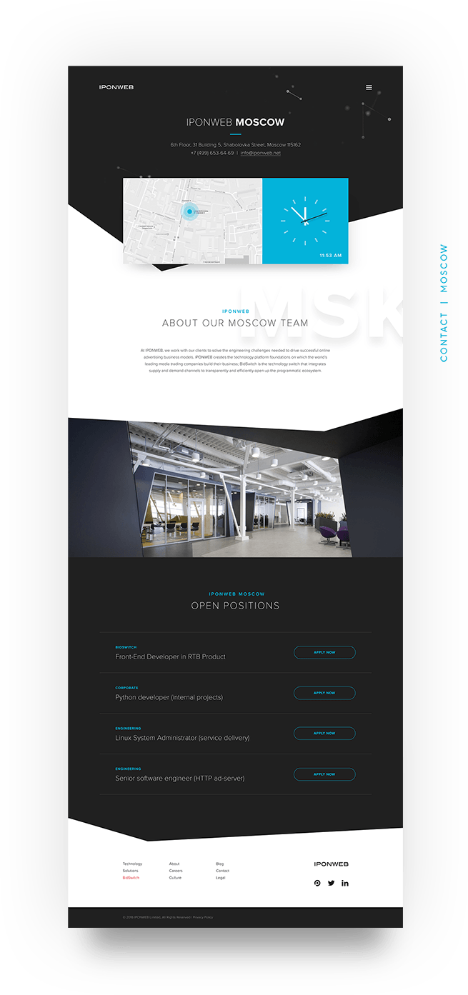
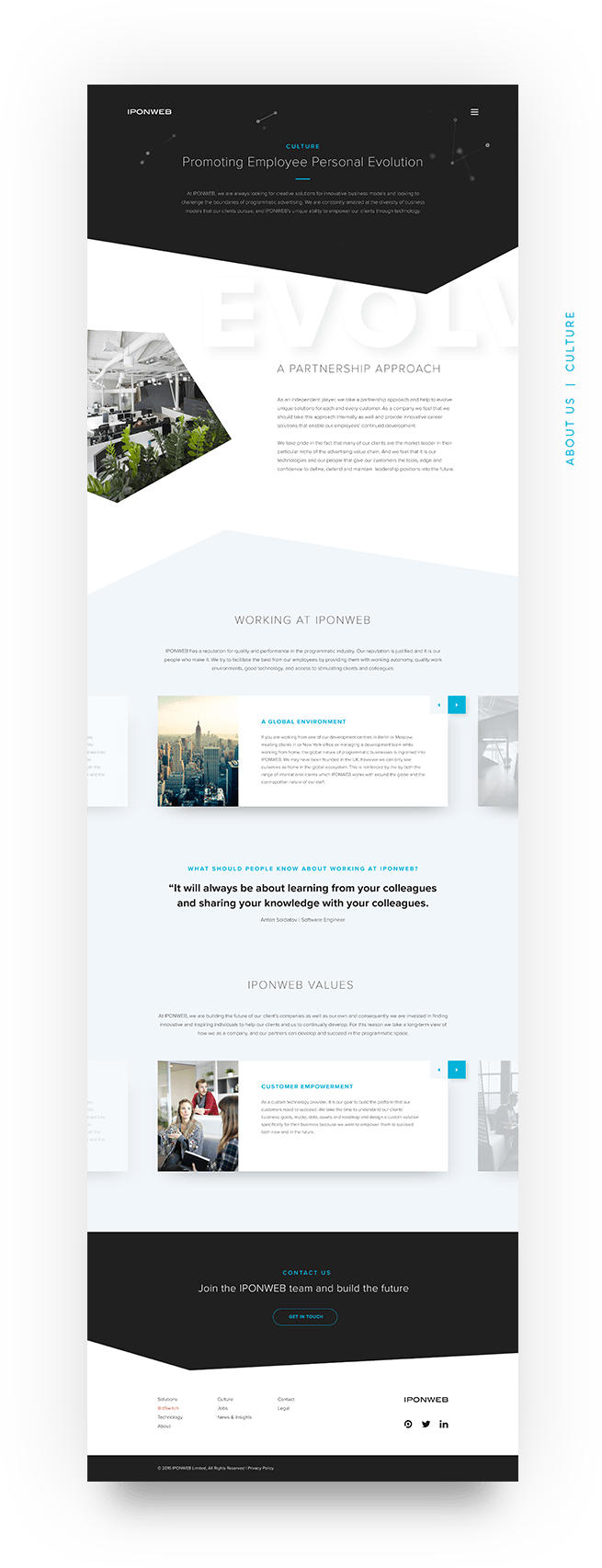
Working closely with the client to understand their business, I helped define a site structure and information hierarchy. I then worked up wireframes and prototypes to show how their huge set of detailed content could be organised in a way that was simple and easy to navigate.
Website Design
The existing brand used flat ‘nodes’ and connections with black as a lead colour. To expand this into a style that could be used consistently across the site, I added a blue to the primary palette that added some variety and helped break the sea of information into consumable chunks. Once this was combined with simple blocks of content, harsh geometric shapes and good use of space, the website had the desired impact.
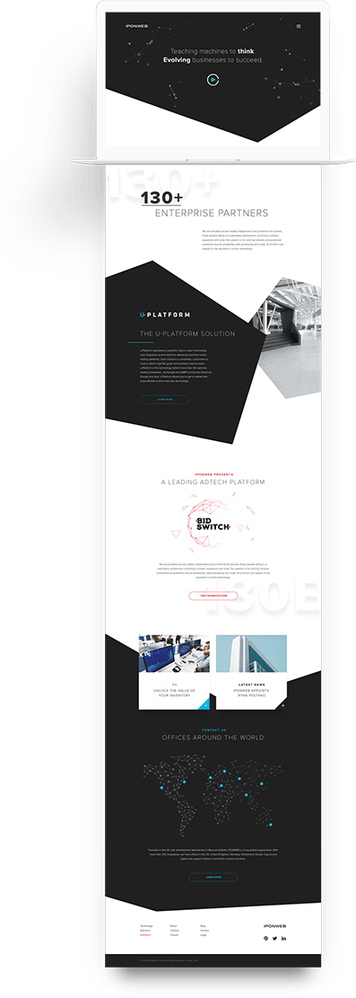

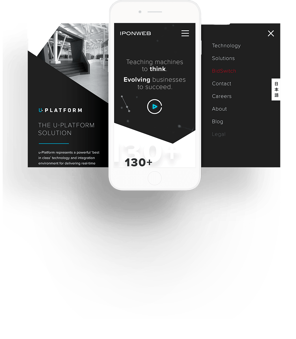
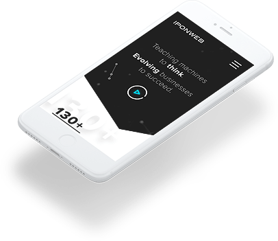
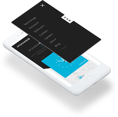
Fully Responsive
Because the geometric shapes cutting through various images and copy blocks is a key brand asset, it was important to make sure each responsive state was considered. I defined visual designs for devices from mobile up to large retina displays to ensure the design could work on any form factor.