Verne Global
Verne Global own and operate one of Iceland’s largest data-centers. Abundant power and cool air address the key issues facing today’s data revolution – power pricing and availability.
As the number of clients using Verne Global was rapidly growing, the goal was to create a brand that reflected the company’s standing as a credible, established part of the data-center sector. I developed a new brand that made Verne become instantly recognisable and feel much more professional and mature compared to their previous approach. As well as re-creating multiple brand assets, a key part to this project was to design a website that reflected their new image.

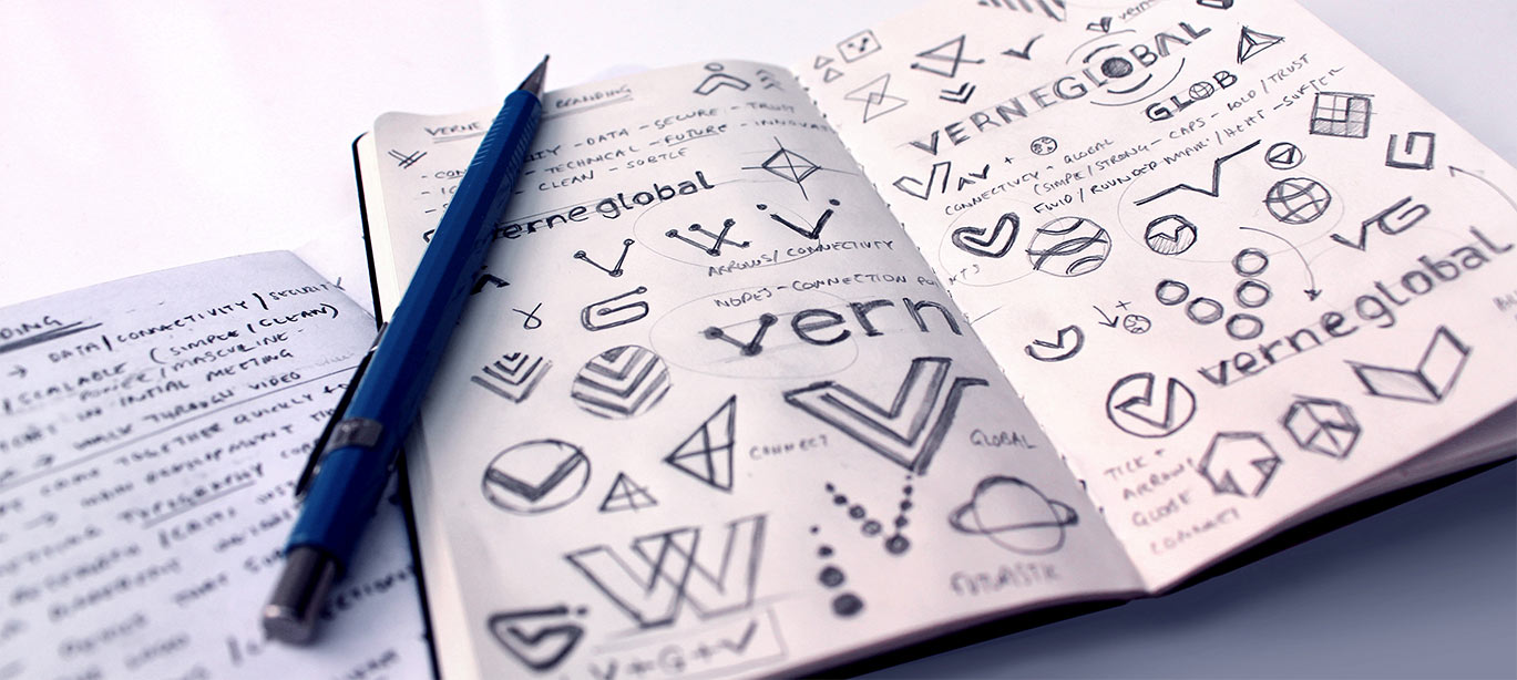
The Wordmark
The wordmark is built around three elements – connectivity, data flow and the data centre itself. Using arrows within the V & A helps portray motion and connectivity, contained within a bounding box to represent security and a blueprint of the plot.
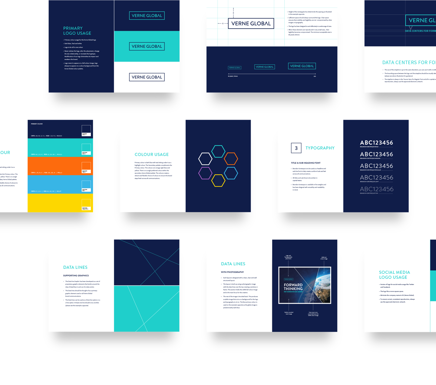
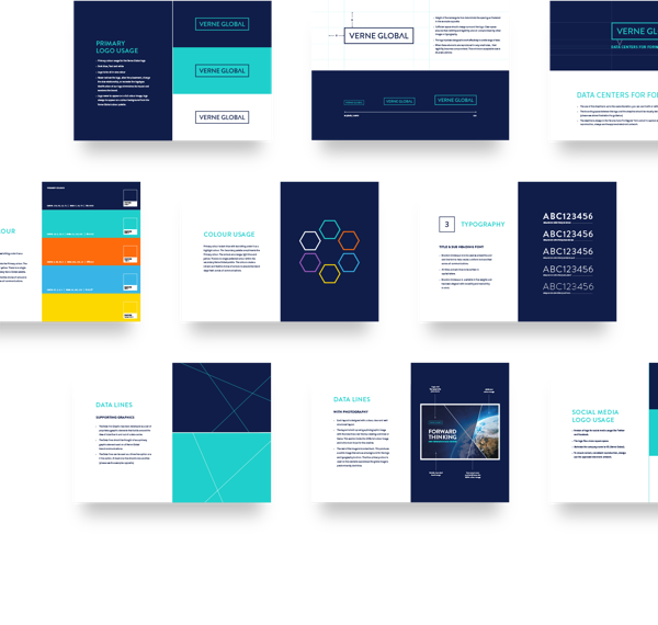
Brand Building
The new Verne Global brand had to work in a wide array of settings - from trade show stands to print ads, from every online incarnation and as signage within the data centre itself. I developed a meticulous set of guidelines containing an extensive colour palette along with typography and design constraints strong enough to support the brand without a heavy reliance on a restrictive set of corporate colours allowing more creativity across campaigns.
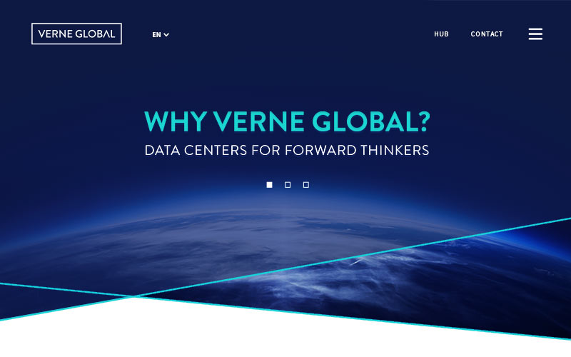
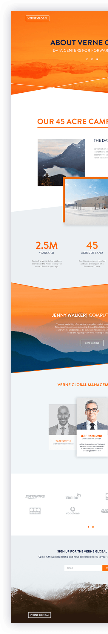
Website Design
Interaction and motion design were very important factors to give the website the polish it required. I designed a unique header section and horizontal navigation that made the site easy to explore and created impact when first landing on the homepage, working with the developers to bring it to life across devices.
Content Hub
Verne already had a library of great content including blog posts, discussion papers, and videos that I wanted to make sure was shown off to maximum effect. Through a well thought out user experience and the clean, bold brand principles I’d set, we achieved a beautiful site design that was easy to explore and constantly engaging.
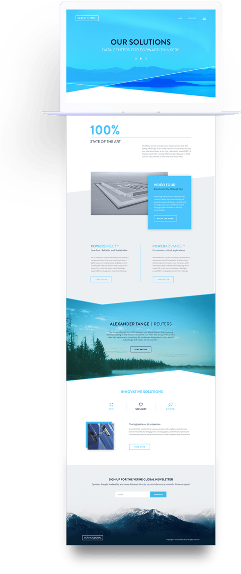
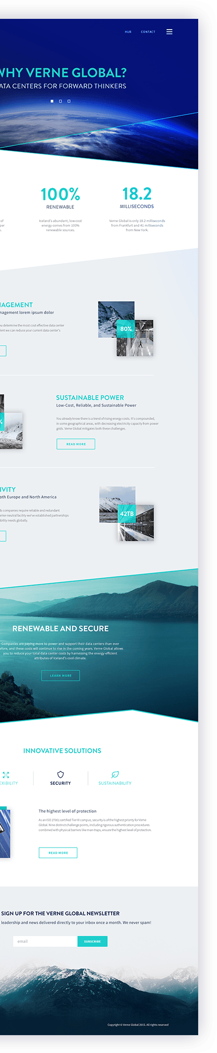
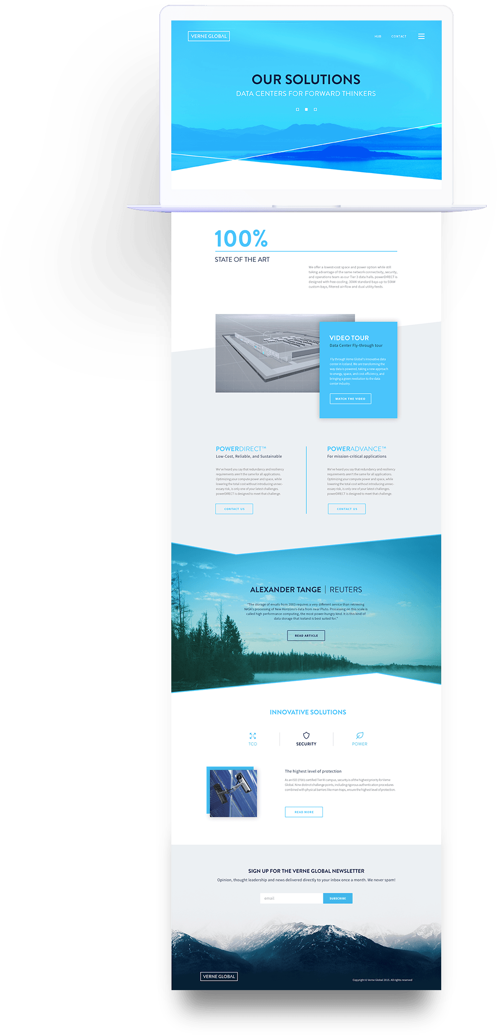
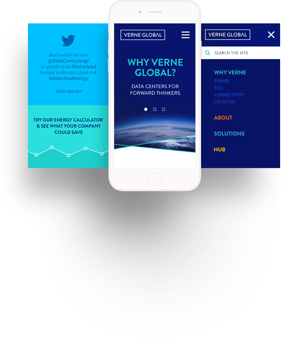
Beautifully Responsive
It goes without saying that the website was fully responsive but it needed to have the same ease of navigation, discovery and visual impact at every screen size. Working through the early UX phase it was always at the forefront of my mind to design the site so that the content was arranged into a compelling narrative no matter what device it was viewed from.