Lackey CMS
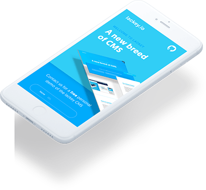
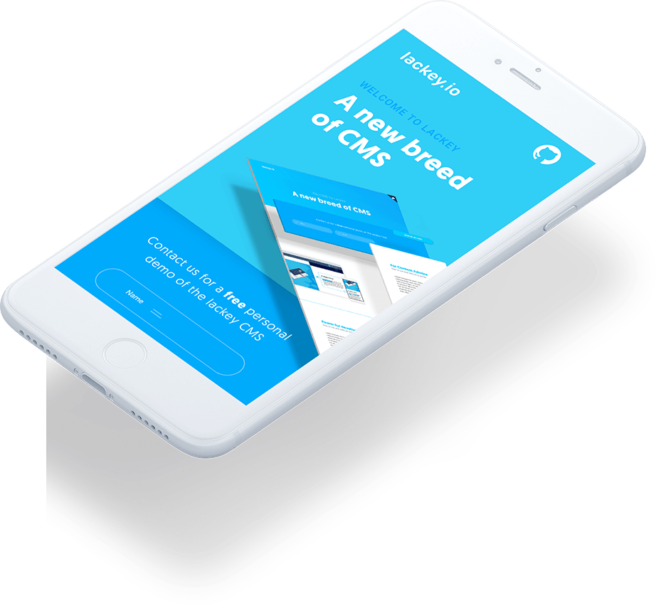
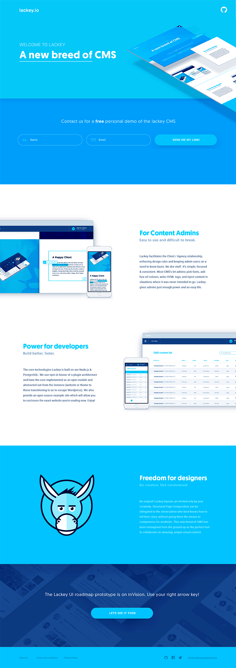
Lackey was designed to be an entirely new content management system. The mission was to provide ease for admins, power for developers and freedom for designers to deliver beautiful, performant websites.
I worked with the Lackey team from the ground up on every aspect of the product. The brief for the branding was to create a high impact yet friendly identity, which would appeal to developers. I worked with the product and dev team on the UX/UI as well as creating all the brand assets and marketing website. Desiring a brand to differentiate Lackey from it’s visually unattractive and boring peers, I decided to build the identity around a glossy yet fun and slightly irreverent mascot character.
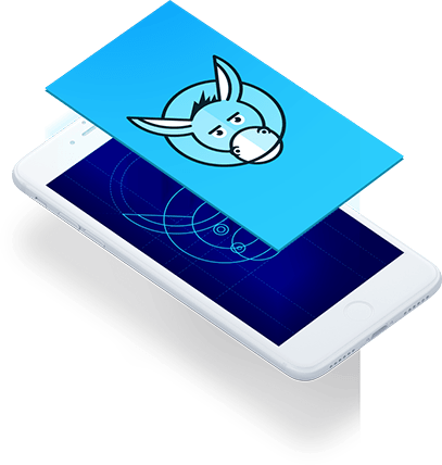
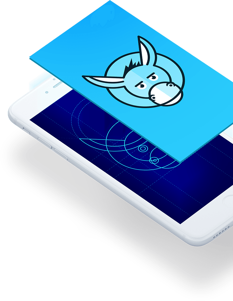
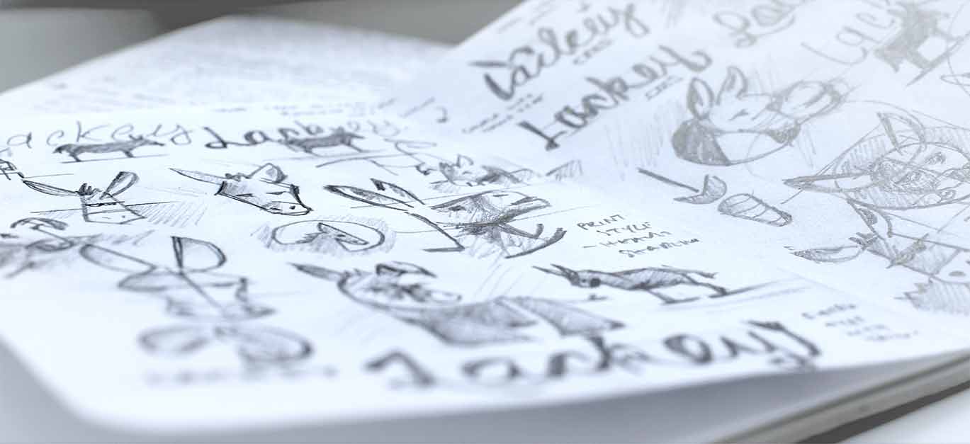
The Logo
The rationale behind the product name was that ‘Lackey does all the donkey work for you’ when building and managing modern web applications. I built the logo on a perfect circular grid representing the CMS framework, then used bold colours and thick strokes to bring the marque to life.


Brand Development
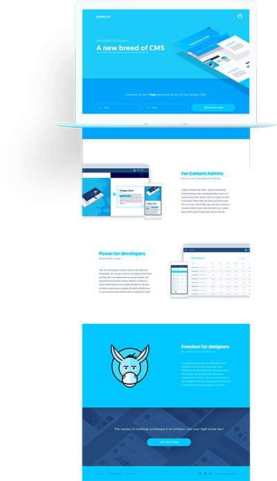
Built around the Lackey character, I crafted a comprehensive brand that’s effervescent, exciting and approachable. Combining simple clean type with vibrant colours helped create striking marketing assets and improved the user experience for the product.

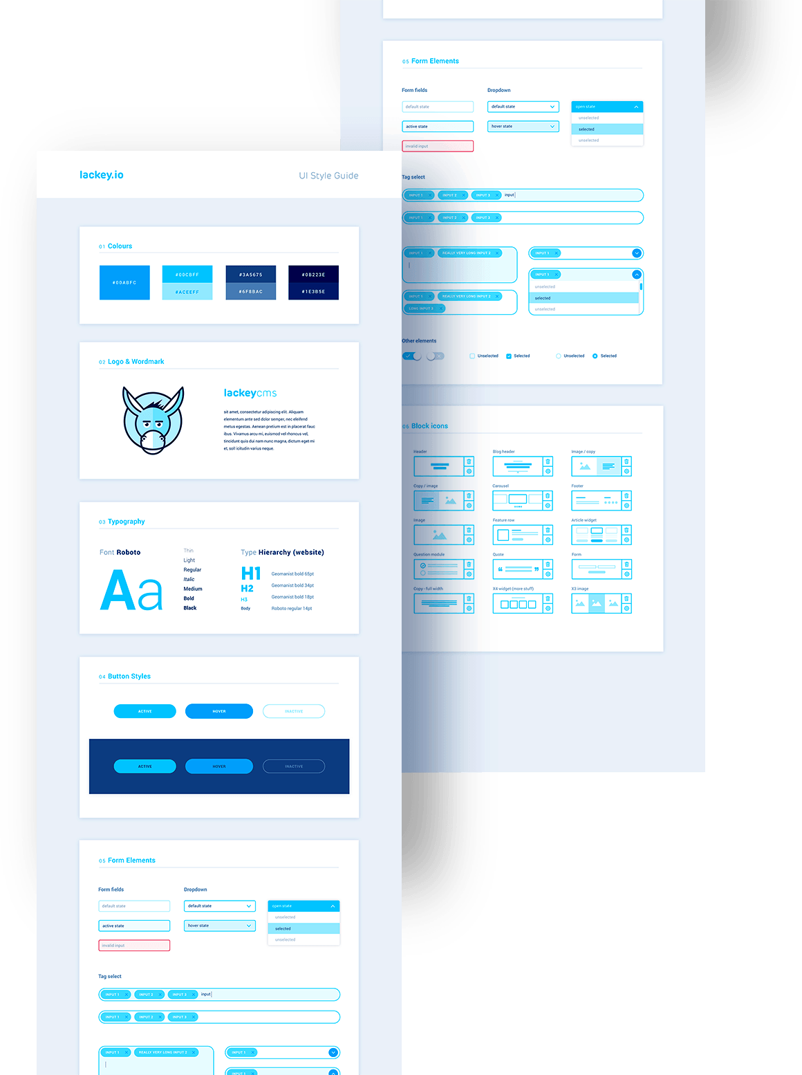
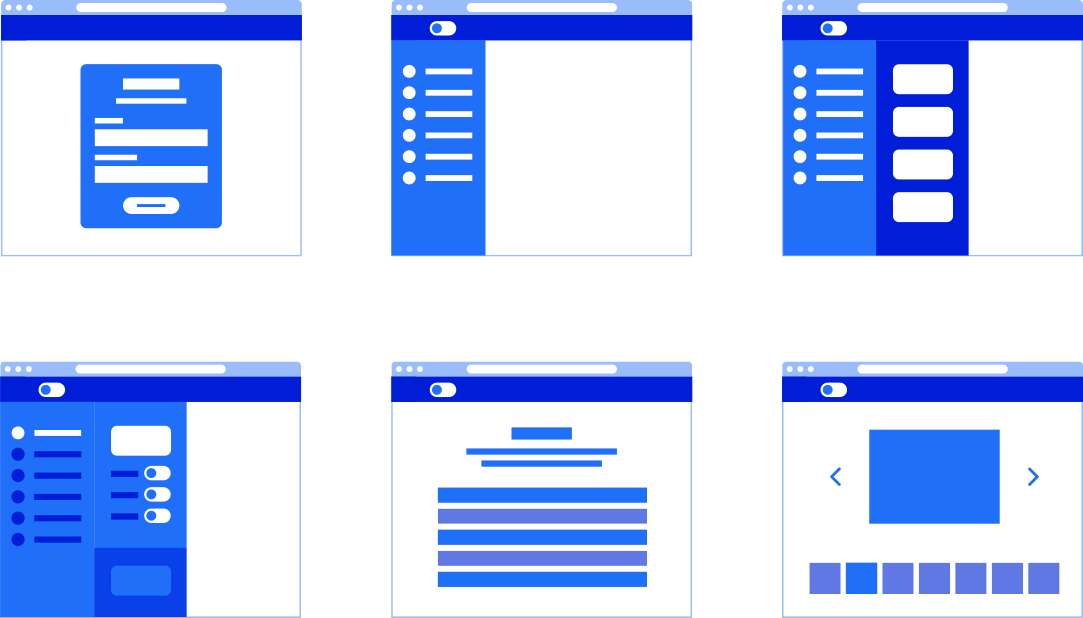
UX Design
There was already a functional user interface in place when I was brought onto the project but it was overly busy and in need of improvement and art direction. I worked closely with Lackey’s product owner/UX lead to develop and test multiple iterations of the platform before we moved into designing the user interface. The Lackey product was a very ambitious undertaking and as you can see from the interface elements in my designs, our objective was to create the best CMS user experience possible.
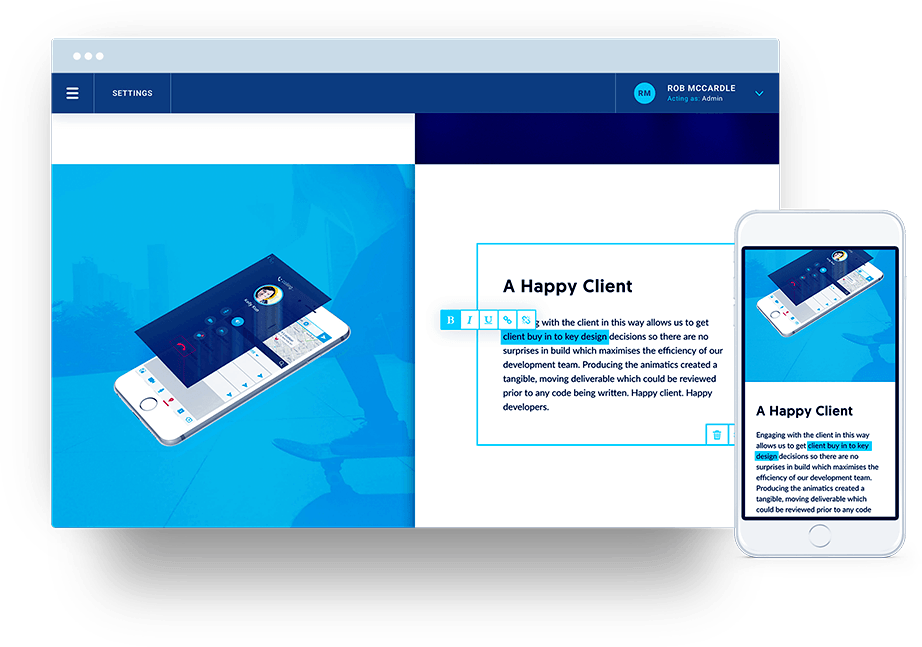
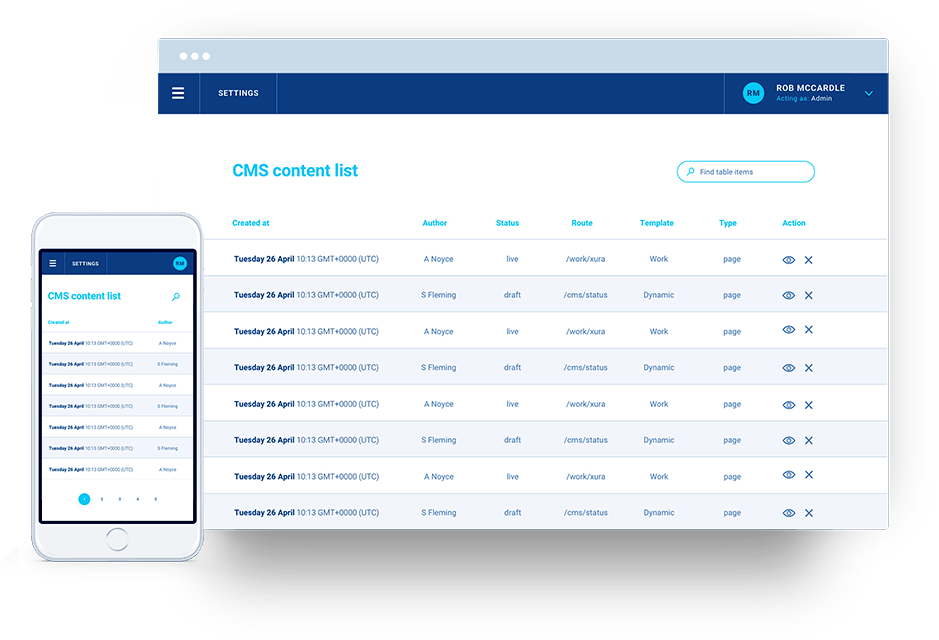
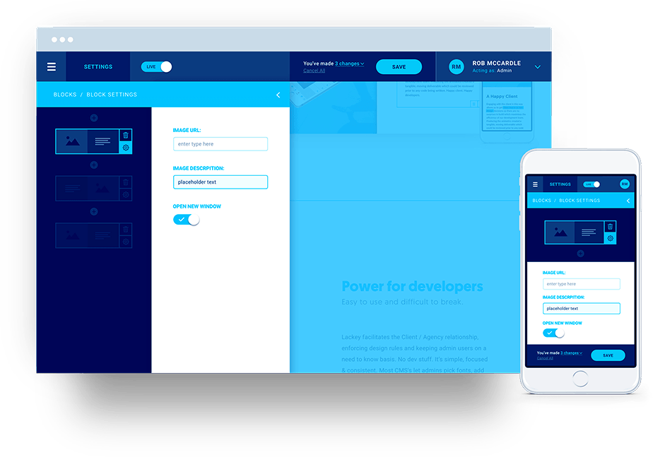
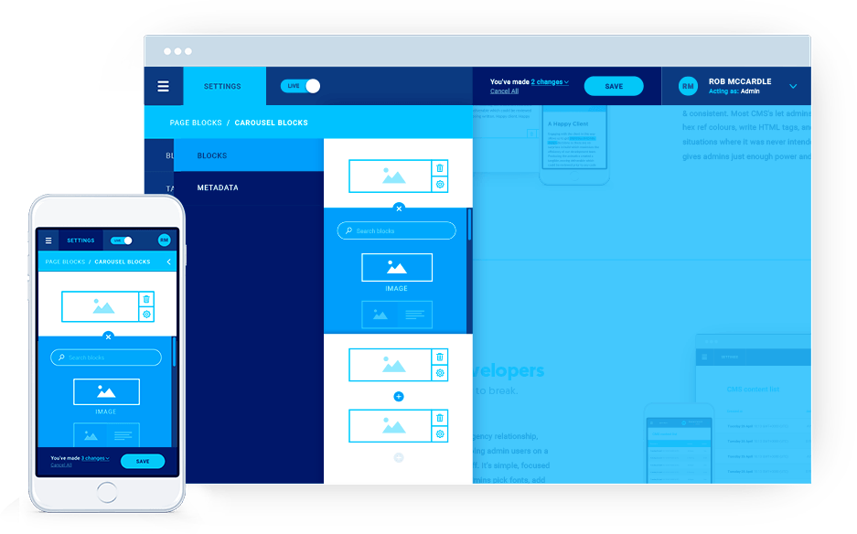
UI Design
With the brand principles set, the visual design came together extremely quickly. Where the face of the brand is bold and eye-catching, I wanted the UI to echo that while still feeling professional and most of all clear and easy to use.